Inclusive Design Considerations
It is important to make any graphic, illustration or application as accessible as possible using inclusive design methods. Whether that be a simple poster, logo, or widely used website, it is important that it is as accessible as possible. Whilst there are very technical aspects that can be used within software development that assist screen readers, such as using aria labels, there are some more basic and intuitive design considerations for every day presentation too. When designing anything, it is important to have two or more of the below. For example you could have no icons on a nav bar, as long as there are contrasting colours and something that makes it clear the different menus are clickable.

Use Icons
The use of meaningful icons can be incredibly useful to quickly identify the location of links, the meaning of the content within the link, or highlighting the category of information. For example, the home tab of a nav bar might be represented with the classic icon of a house. This means there is no reliance on reading the words within the nav bar, and does not rely on colour cateogrisation.

Clickables
When there is a clickable link on a page, either for navigation within the site itself, or refernces to external pages, it is important to make the UI responsive to show it is clickable. For example, links that underline or change colour on hovering on them, or borders appearing around images which zoom on interaction. This change in state on the element makes it clear that it can be interacted with.

Contrasting Colours
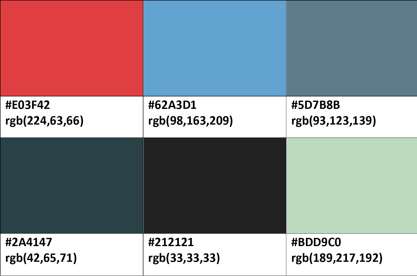
Whilst contrasting colours is brilliant for those with colour blindness as it stops similar colours appearing the same, it is also brilliant for standard users without any form of colour vision deficiency too. It can aid navigation and make the most important and active elements stand out to the user. For example, it can highlight the page the user is on on the navigation menu, or clearly separate different sections of the page.
Inclusive Colour Palette Suggestion